November 17, 2025
Liquid Glass – macOS and iOS 26 update

With Apple's major macOS and iOS26 release and the new “Liquid Glass” design, Tyme had a lot of work to do. macOS and iOS 26 is considered one of the most significant design updates since macOS Big Sur: Apple has not only revamped the visual language of both platforms, but also made iOS and macOS appear more uniform than ever before. The interfaces are more responsive to light, depth, and movement, making them appear calmer and more vibrant at the same time. Everything feels more transparent and fluid – fewer edges, more space, more layers.

What's new?
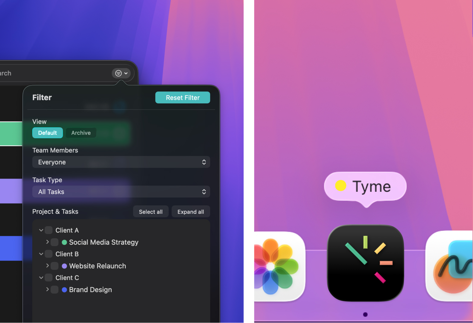
- Fresh app icons for Mac and iPhone: In macOS and iOS 26, Apple is focusing on subtle light edges, soft shadows, mac and the liquid glass effect
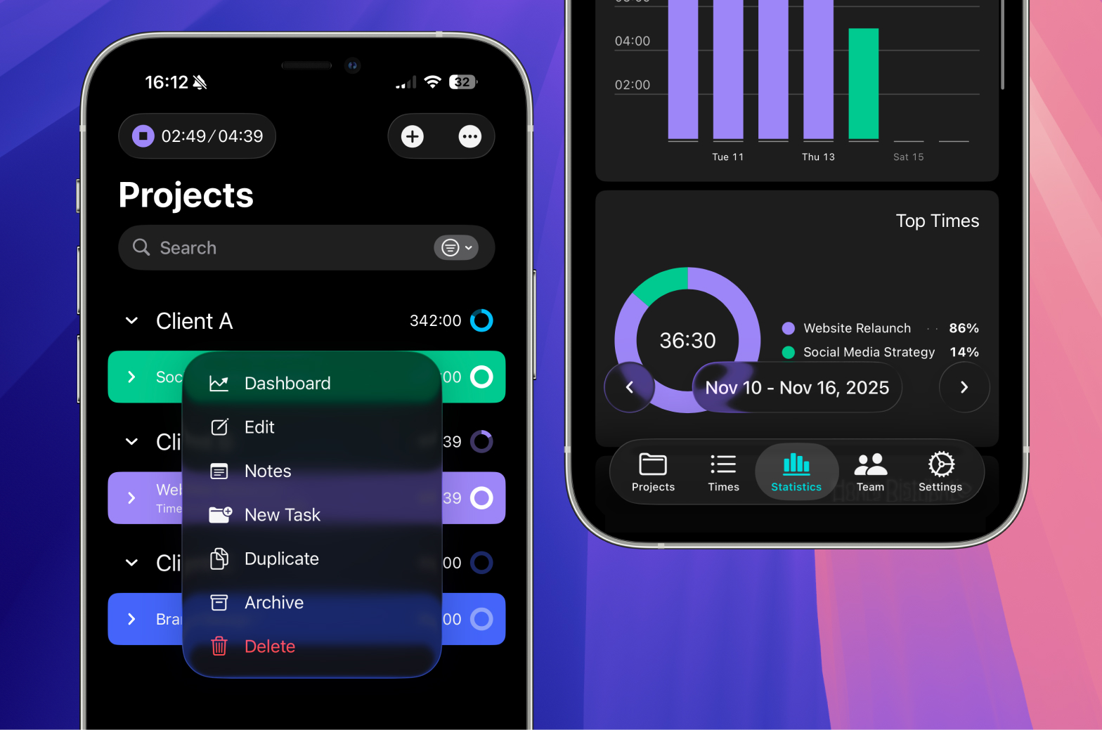
- Newly structured main navigation & display options
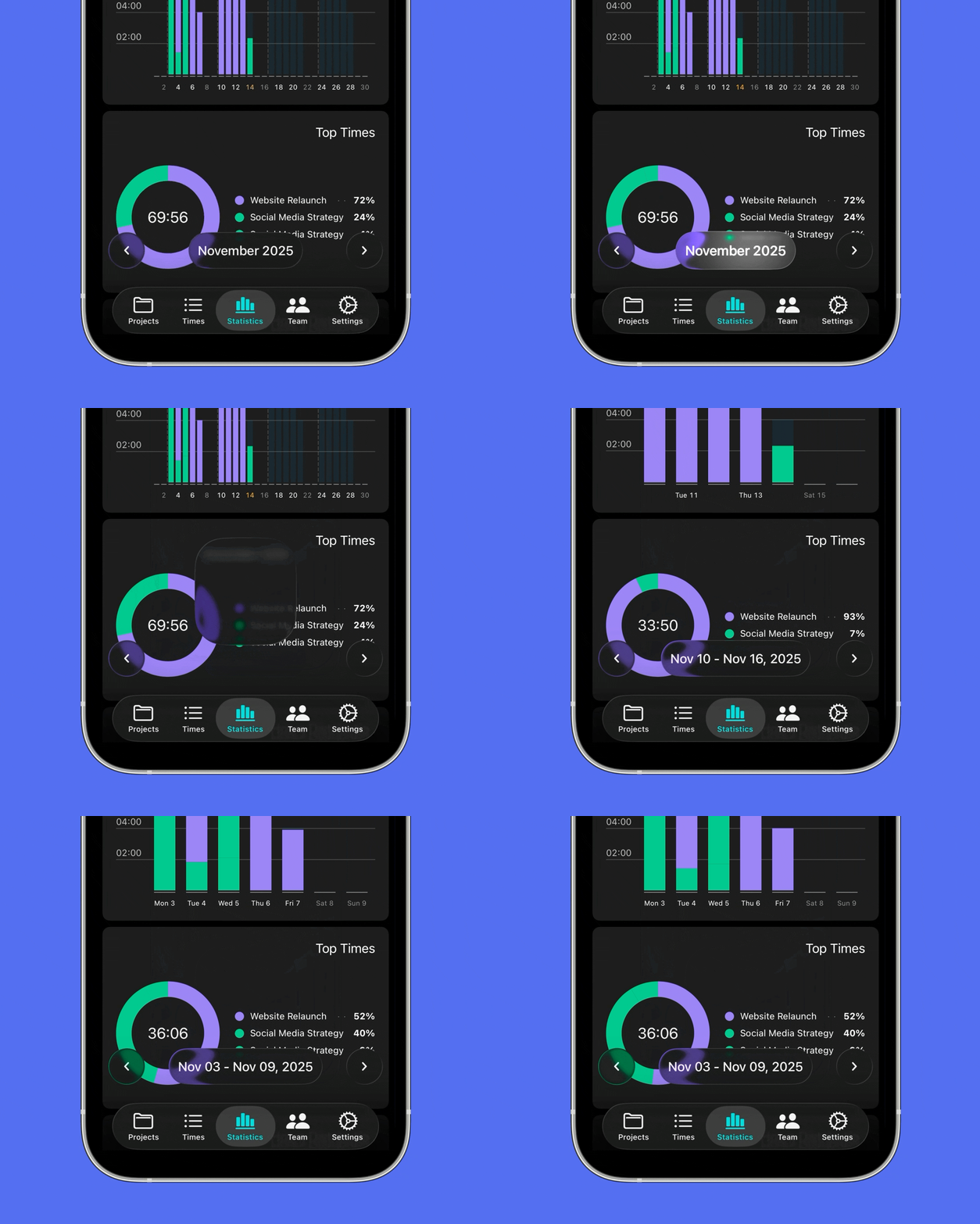
- New date display as a “floating element” in the time entries screen, which appears to float slightly above the background. We used this idea to make the date display more visible, easier to access, and at the same time more elegant
- Rounded corner radius for various design elements, matching the new operating system

Our challenge is to fit Tyme into this new aesthetic without losing our own visual identity. Our goal is to continue to look like Tyme while also integrating cleanly into the new macOS and iOS 26 environment. We have also revised and reorganised internal areas of the app, modernising sections that could be made clearer with the new look.
As with every Apple update, our goal was not just to incorporate new graphic elements. More important to us is balance: Tyme should feel familiar, but at the same time move naturally in the new “liquid glass” world.